glassOS
How the new iOS 14 UI translates directly to Apple glasses
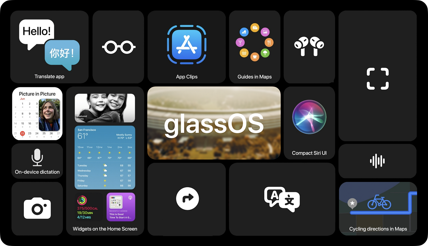
Before we begin, here’s how Apple describes the iOS 14 release:
iOS 14 brings a fresh look to the things you do most often, making them easier than ever. New features help you get what you need in the moment. And the apps you use all the time become even more intelligent, more personal, and more private.
If you pay close attention to the language Apple uses on its iOS 14 Preview page, there’s an awful lot of “compact design,” “quickly get information,” and “doesn’t take up the full screen.”
I think it’s fair to say that Apple is working on some form of an AR & VR headset. What is it gonna look like or do? We don’t quite know yet. We can only take a guess. And the following is my guess at how iOS 14 foreshadows what UI could look like on a pair of their glasses.
Let’s assume Apple’s glasses have a way of presenting UI, be it projection or on a display. And let’s assume that iOS 14 is introducing new UI paradigms that will help make the transition to glasses seamless.
Now, let’s take a look at how almost every corner of the iOS 14 update meant for iPhone can be translated directly to UI on a pair of glasses.
Notifications
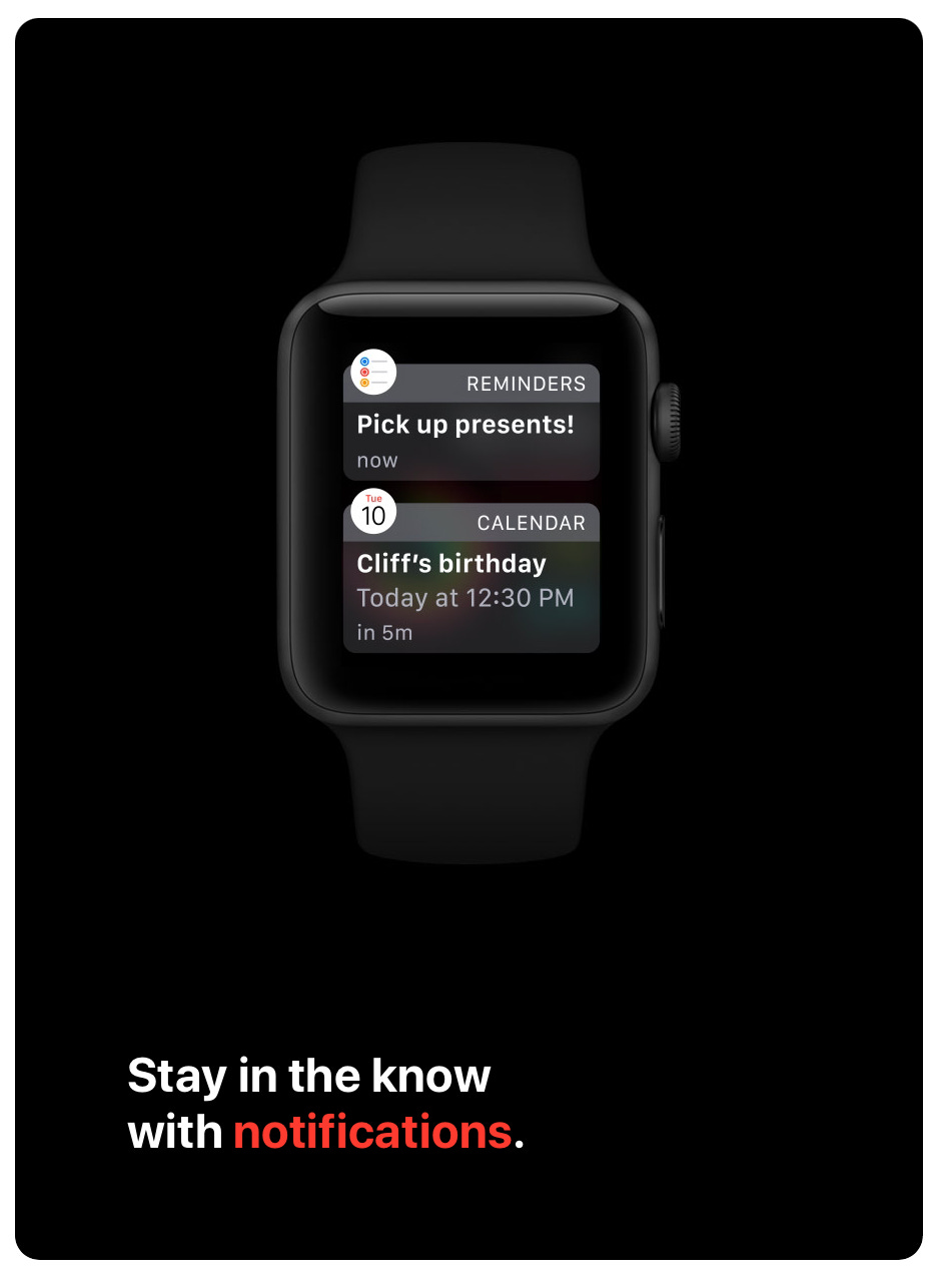
Let’s start small and unrelated to iOS 14. When the Apple Watch launched, it needed a way to present notifications on a small screen. Apple’s solution is a full-screen takeover that looks something like this:
Let’s take a look at how receiving an iMessage might appear on a pair of Apple glasses:


Dark mode is gonna come in handy when it’s nighttime.
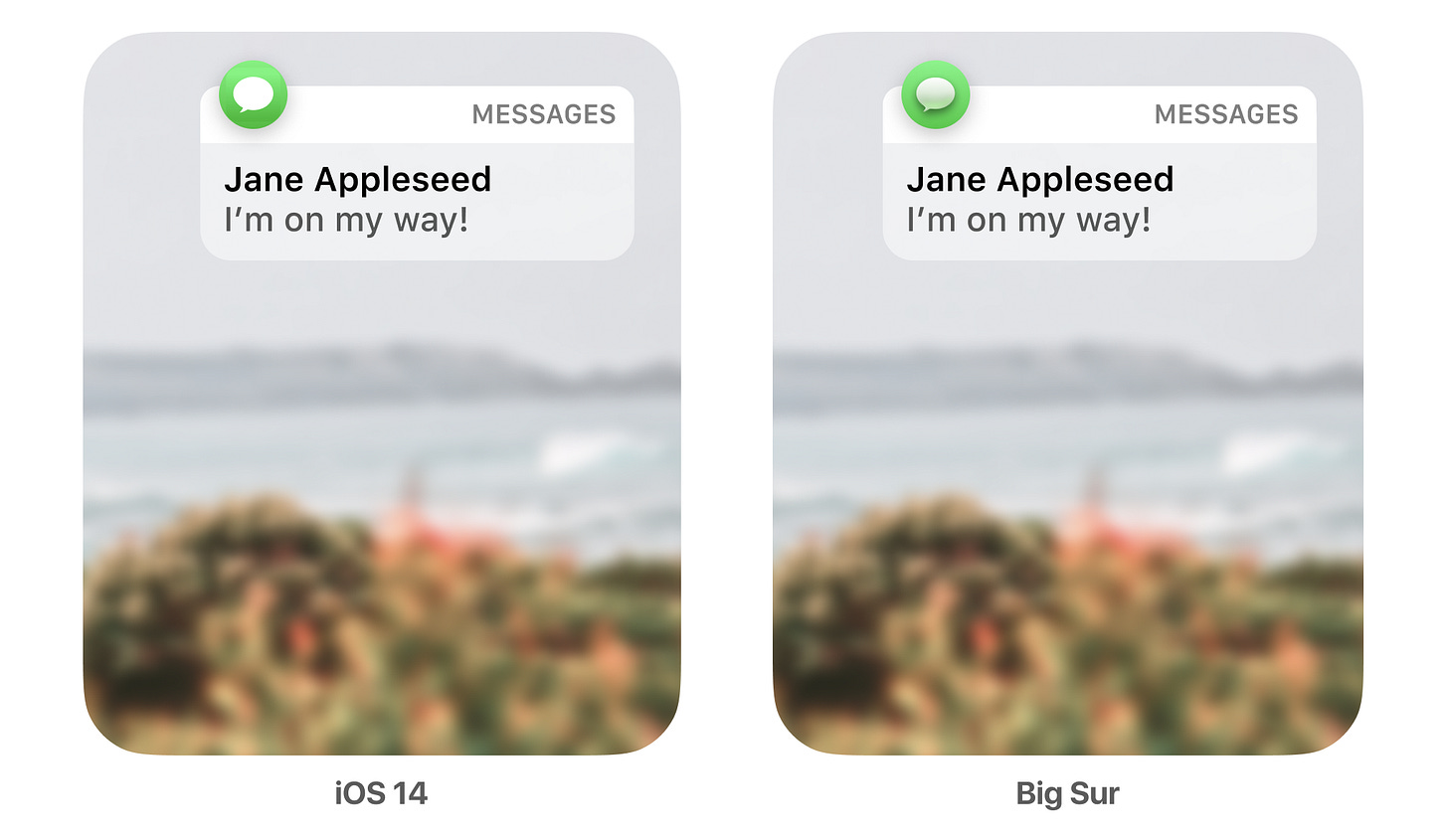
Quick side note: I took a look at using the app icon styles for both iOS 14 and Big Sur. It’s interesting to think about how the shadows and lighting effects of the new Big Sur icons might help to mimic that of what you might find in the real world, especially when the real world and the UI are overlaid. Take a look for yourself:
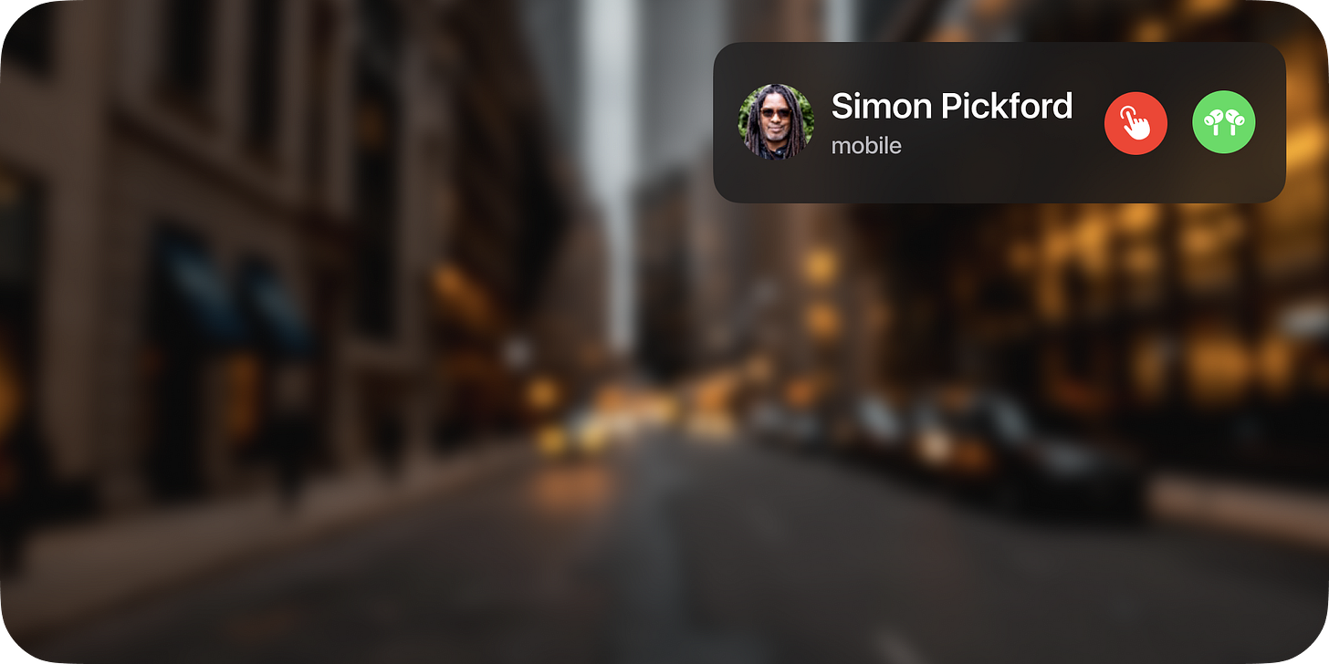
Compact calls
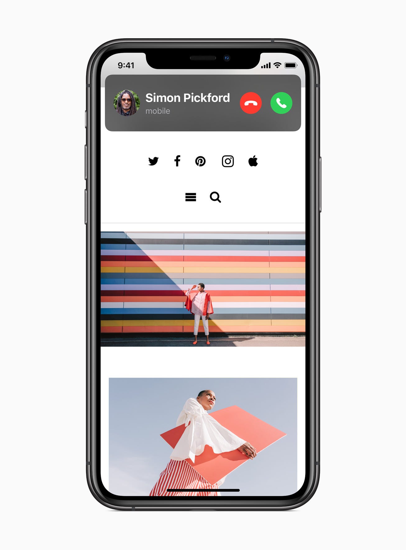
Calls from your iPhone, FaceTime, and third‑party apps display in an all‑new compact design that doesn’t take up the full screen.
iOS 14 introduces a “compact calls” UI, where a call no longer takes up the full screen when it comes in.
How might that look on a pair of glasses?
Maps
A persistent heads-up display for turn-by-turn directions in Maps:

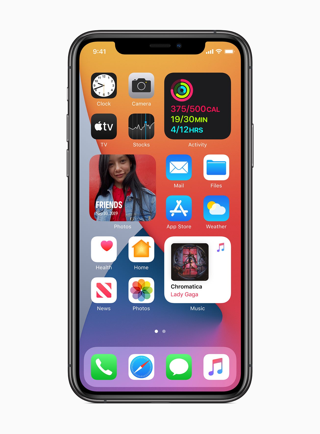
Widgets
Widgets have been totally redesigned to give you more information at a glance — and now you can add them to your Home Screen. Choose from different sizes and arrange however you like.
“Hey Siri, what does my morning look like?”

“Hey Siri, where did I park the car?”

Apple is going all-in on SwiftUI, as it represents a single framework to build UI across every single one of their UI platforms. I can’t see how that would be any different here. Widgets just so happen to be built entirely using SwiftUI too. Developers are building in SwiftUI, and with widgets coming soon, it sure sounds nice to have already built your app to support glasses by adopting widgets.
Picture in Picture
Now you can keep watching videos or continue your FaceTime call while you use another app.
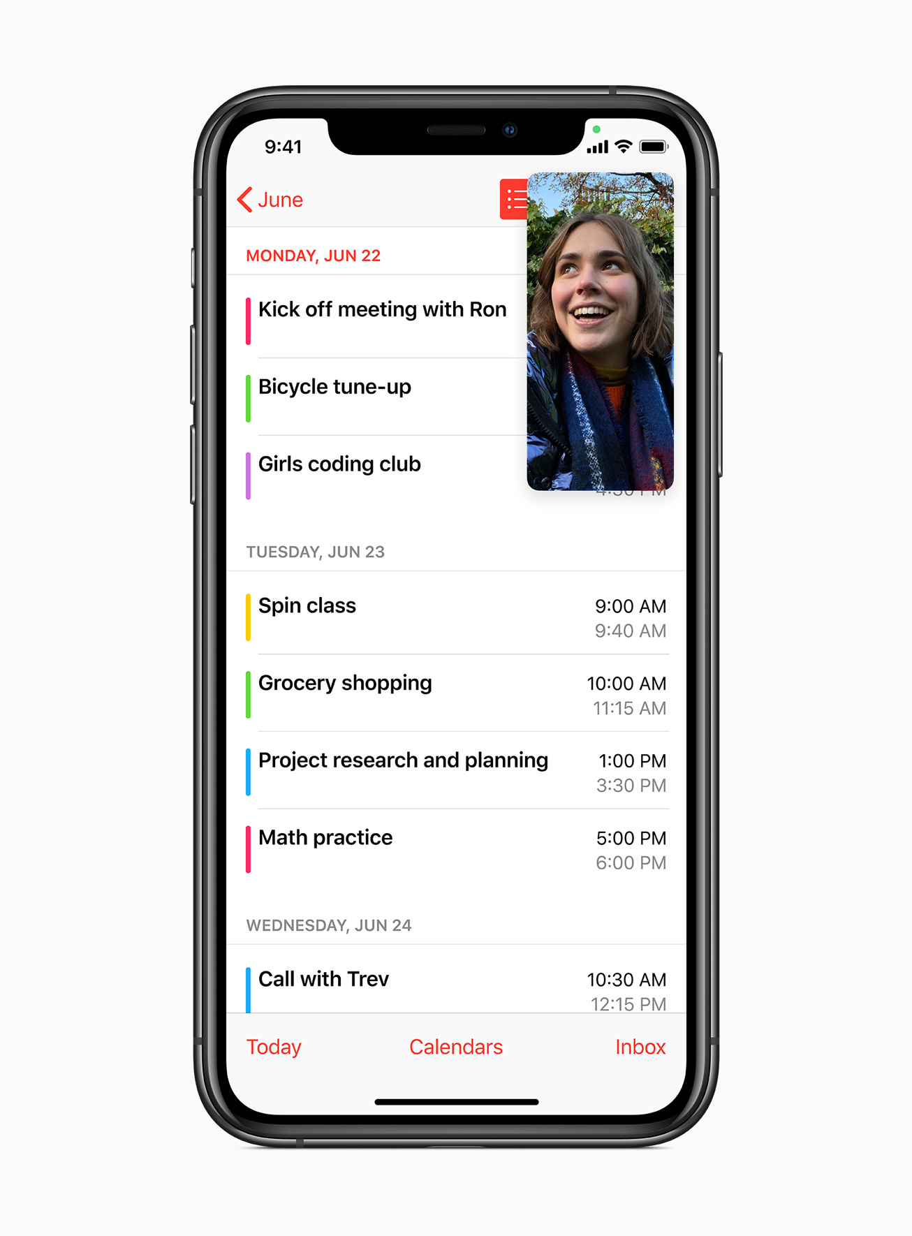
On a FaceTime call during a walk in the park

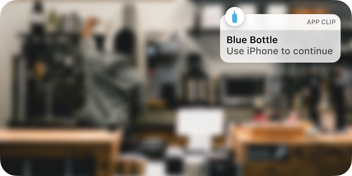
App Clips
App Clips are easy to discover and use right in the moments you need them. Like renting a bike, paying for parking, ordering food, and so much more.
After scanning an App Clip code on your glasses:
Siri’s compact design
Siri is a vital way to get information and get things done. And thanks to a new compact design, you can take advantage of everything Siri can do without losing your context.
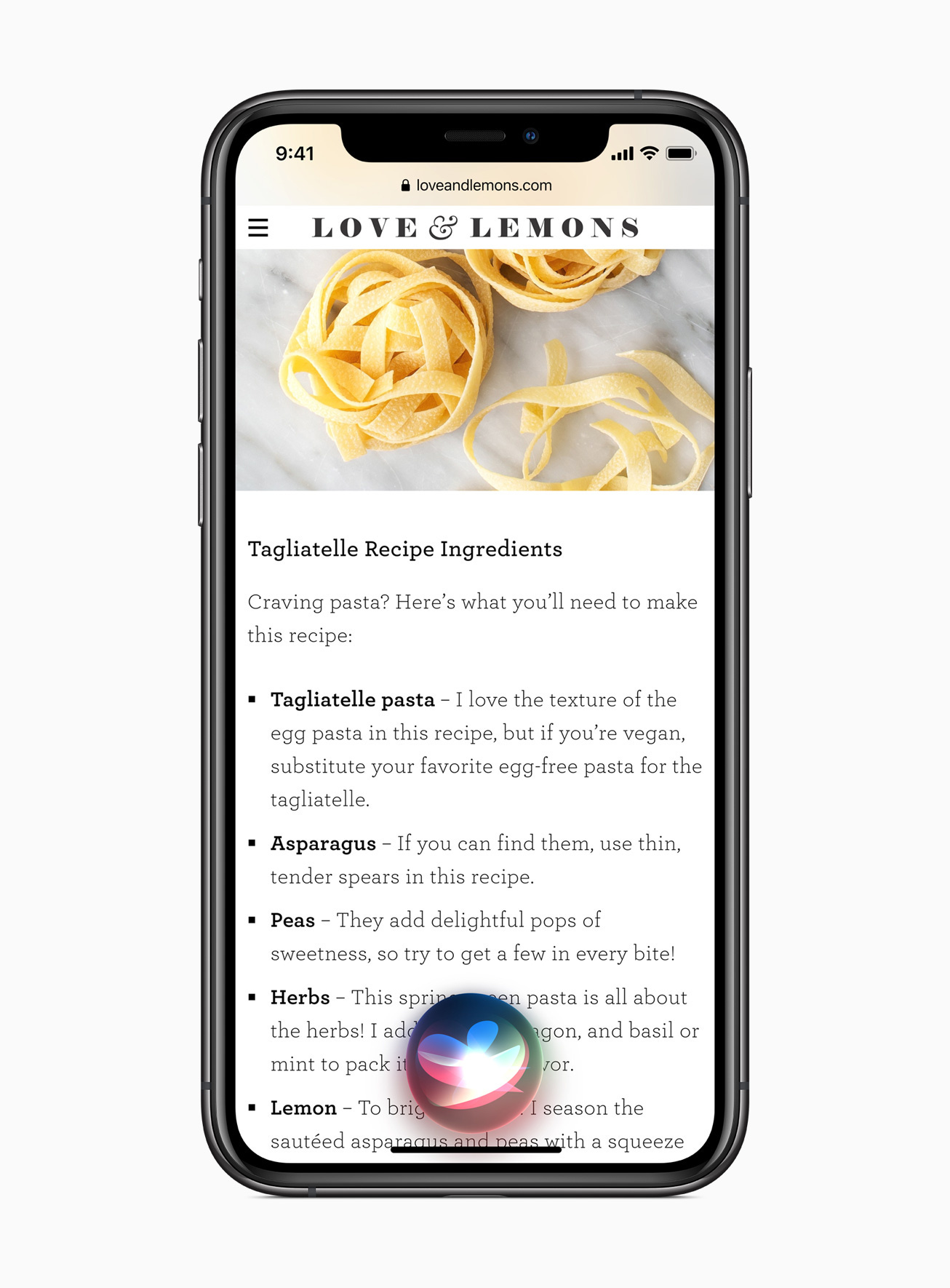
“Hey Siri, what’s the recipe for Tagliatelle?”

“Hey Siri, what’s the score of the Blues game?”

Out of the way, and fits nicely in the corner similar to where iPadOS puts it as well.
Privacy
Recording indicator
An indicator appears at the top of your screen whenever an app is using your microphone or camera. And in Control Center, you can see if an app has used them recently.
While talking on the phone:

While recording a video:

AirPods
Seamlessly move between devices without manually switching your AirPods. If you finish a phone call on your iPhone and pick up your iPad to watch a movie, AirPods automatically switch over.
Identical to the new AirPods notification that Apple introduced in iOS 14:

Translate
Conversations across languages should feel natural and easy, and should have the ability to remain private. Introducing the all-new Translate app, designed for conversations across 11 different languages.
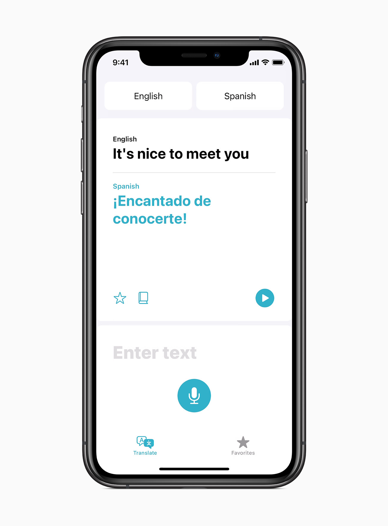
“Hey Siri, how do I say “it’s nice to meet you” in Spanish?”

“Compact design,” “quickly get information,” and “doesn’t take up the full screen.”
Are you getting it? The new UI most likely isn’t random. This is intentional. And I call it glassOS.
Media from Apple for editorial use.
Photos from Unsplash.


This is amazing insight and I believe 100% spot on. Notifications, Widgets, App Clips, AirPods, Privacy were all steps towards Apple Glass. The UI won’t be some crazy new thing, it’ll be what we know and expect.
Awesome post. This is the kind of way you spect Apple would play the glasses hype to the next level. I can see all this even embedded in a car front glass as a new full interface and experience